Very exciting things are happening in the Rule platform right now and we will continuously release new, cool updates and features during the summer and autumn. The decisions we have made about updating and developing the platform are largely based on wishes and views from customers and partners. This means that we constantly work agile and adapt to the needs of customers and market development. The updates you will encounter in the platform next are the views for “Journey Grid” and “Subscribers”. Below we will tell you more about the updates and interview our product team about what the process has looked like and the thoughts behind the updates.
A new view of your Journeys
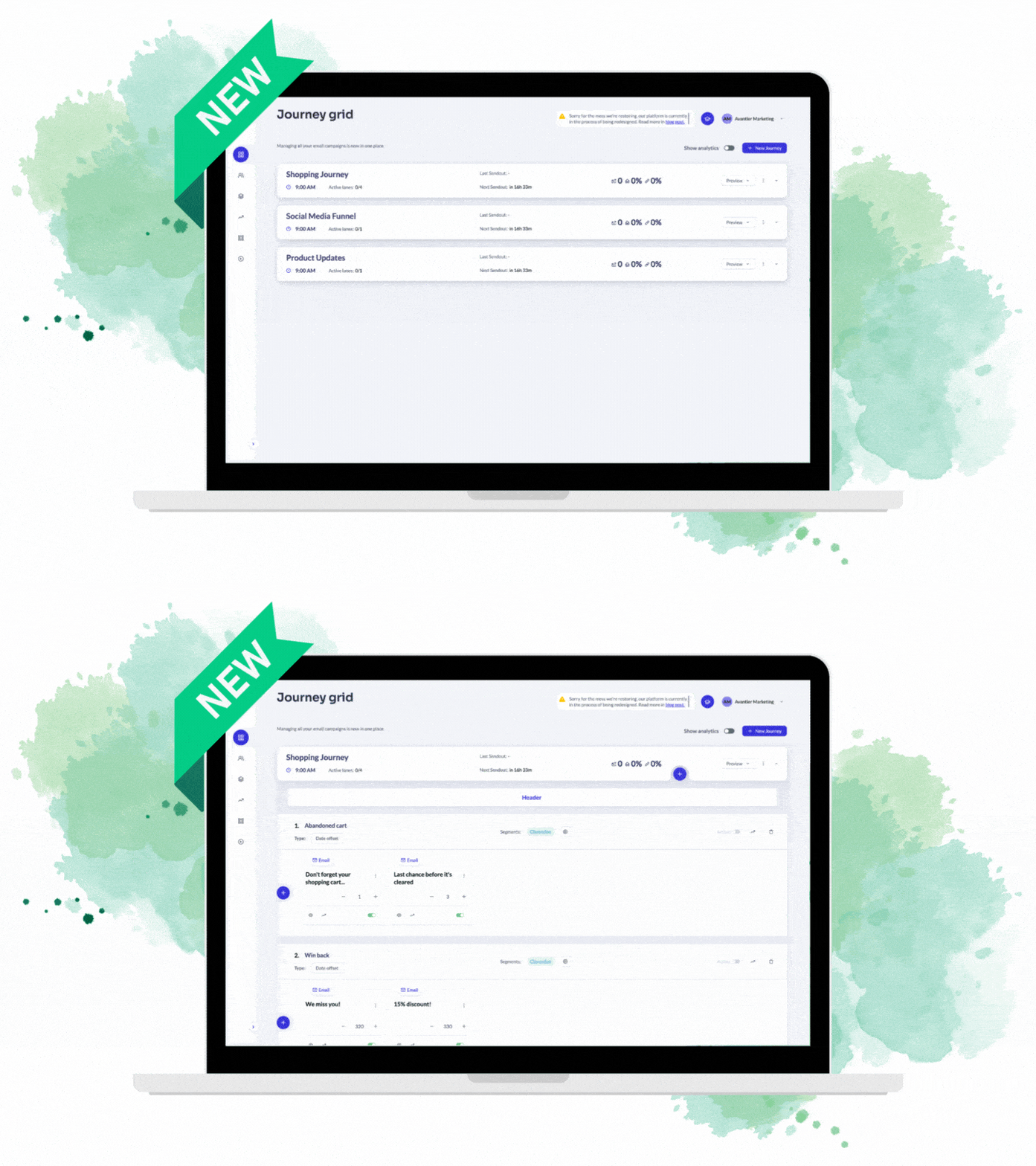
The first update is in the design in the view you see below in Journey Builder, which we call Journey Grid. So it is your campaign view where you have an overview of your communication flows, and it is also here that you set up your first “journeys”, if you have not already started with it. With the new design, you can easily navigate between your communication flows and manage your Journeys smoothly.

More complete customer cards about your members
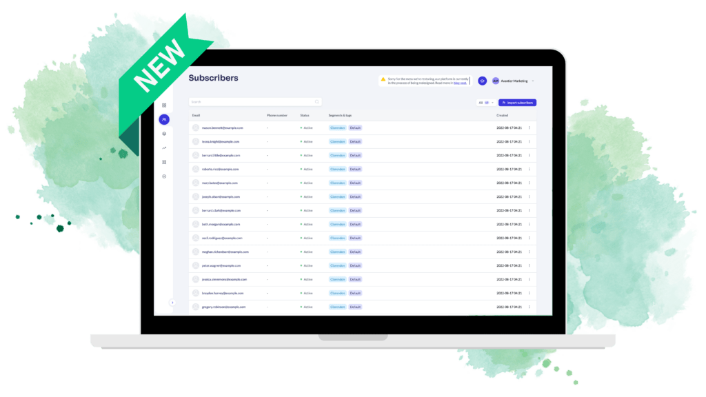
In the side menu inside Journey Builder, there will be a new icon that you click on to move on to an updated view of its members. Inside the subscriber list, where you will find your member list, you can click on a member and directly get to the membership card, where you will find all the customer’s data and activity. With the updated view, users will be able to more easily select members in the subscriber list, and the customer cards are now more complete and easier to work with. You will also find all the functionality in the regular Rule platform today in Journey Builder, but with an updated design and a more logical layout.

Rules' product development team explains:
Our thoughts when we started developing the new design
The Rule platform has had the same design for several years, and as the platform’s functionality developed, we felt it was time for the design to do the same. For several months, we have been working on developing a completely new design that will reflect the modern functionality the platform offers. We have for a long time collected important feedback from customers and partners on how Rule can be easier and more logical to work in. All of these points have been the basis when we started this project. No existing functionality will disappear from the platform, but the focus here has been on increasing flexibility and user-friendliness.
What we have taken inspiration from
When we have gathered inspiration for the new design, we have partly looked at our competitors, but above all, we have carefully studied modern design trends. Our goal is for Rule to provide a clear and eye-catching overview of the platform, regardless of whether you log in via your computer, tablet, or phone.
How we proceeded
When working with the new design, we started from feedback collected over a long period from customers, colleagues, and partners to prioritize the most desired improvements. Together with our in-house design team, the new platform began to take shape, and our biggest goal was for the new design to match our new graphic profile, which is displayed on our website, among other places.
What we want to achieve with these changes
The goal of the design project has been to create a stylish and attractive impression in the platform with today’s standards for a comprehensive overview, together with easy-to-use list choices of commonly made options. All list views, such as member lists, should be easy to understand and navigate. As a user, you must be able to build advanced communication flows in a simple and logical way and make full use of the platform’s functionality, regardless of your digital maturity level.

Explore the new views and learn more about the Journey Builder in our interactive guides.


