In the digital world, every click matters.
Driving conversions and engagement requires effective CTAs (Call to Actions) that spark interest and lead to action.
A well-placed and thoughtful CTA can be the difference between a lost visitor and a new customer.
But what exactly is a CTA and how can it be used to increase conversions on your website and in your newsletters?
Let’s dive deeper!
What is a CTA (Call to Action)?
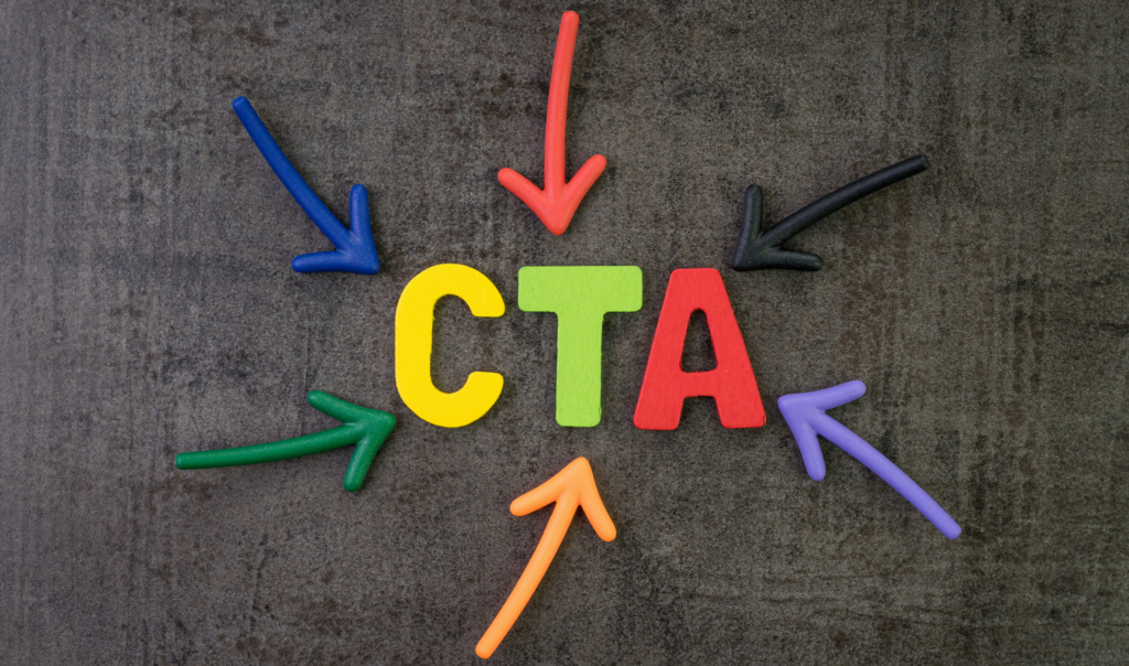
CTA, or Call to Action, is a marketing term that refers to a call to action.
It is a short and punchy text or button that prompts visitors to take a specific action, such as “Download now”, “Learn more”, or “Sign up today”.
An effective CTA helps guide visitors through the customer journey and towards a desired goal.
What does CTA mean?
CTA stands for “Call to Action”, which directly translates to “call to action”.
It is a critical element of digital marketing and is used to create a clear direction for users, whether it’s filling out a form, buying a product or subscribing to a newsletter.
A good CTA simplifies things for the visitor
One of the main benefits of a well-worded CTA is that it simplifies things for the visitor.
By using clear and action-oriented phrases, you help your visitors understand what to do next.
An effective CTA is short, concise and easy to understand.
It should stand out on the page, either through a strong contrasting color or through its placement.
Increase newsletter conversions with the right CTA
Newsletters is a powerful tool to engage your audience and drive conversions.
By using the right CTA in your newsletters, you can effectively increase open and click-through rates.
A CTA in a newsletter should be enticing and give readers a reason to click.
Examples of effective CTAs for newsletters include “Read our latest blog”, “Take advantage of our special offer”, or “Sign up for our webinar”.
Why is CTA needed?
A CTA is needed to convert visitors into customers, followers or subscribers.
It gives the user a clear direction and creates an experience that is engaging and user-friendly.
Without a CTA, visitors can easily become confused or unsure of what the next step is, which can result in a higher bounce rate and fewer conversions.
Examples of different Call to Actions
There are many different types of CTAs depending on their purpose and where they are placed.
Here are some examples:
- CTA for purchase: “Buy now”, “Add to cart”, “Get your copy today”.
- CTA for registration: “Sign up now”, “Sign up for free trial”, “Join our community”.
- CTA for download: “Download the guide”, “Get your free e-book”, “Download our app”.
- CTA for social sharing: “Share on Facebook”, “Tweet this”, “Follow us on Instagram”.
CTA button - what is important to consider?
A CTA button is one of the most effective ways to call to action.
The color, text and placement all play a crucial role.
Choose a color that contrasts with the rest of the page to make the button stand out.
The text on the button should be action-oriented and direct, such as “Get access now”, “Discover more”, or “Start your journey”.

Now you know what a call to action is
They are more than just buttons or texts – they are key to guiding your visitors through their digital journey.
By using effective CTAs you can increase conversions, engage your visitors and drive them towards the actions that matter most to your business.


